Phi Point
Visual identity designed for a small physiotherapy clinic. The concept is built around the Greek letter Φ (phi), a symbol associated with the golden ratio, harmony and balance, that reflect the clinic's approach to health, movement and wellbeing.
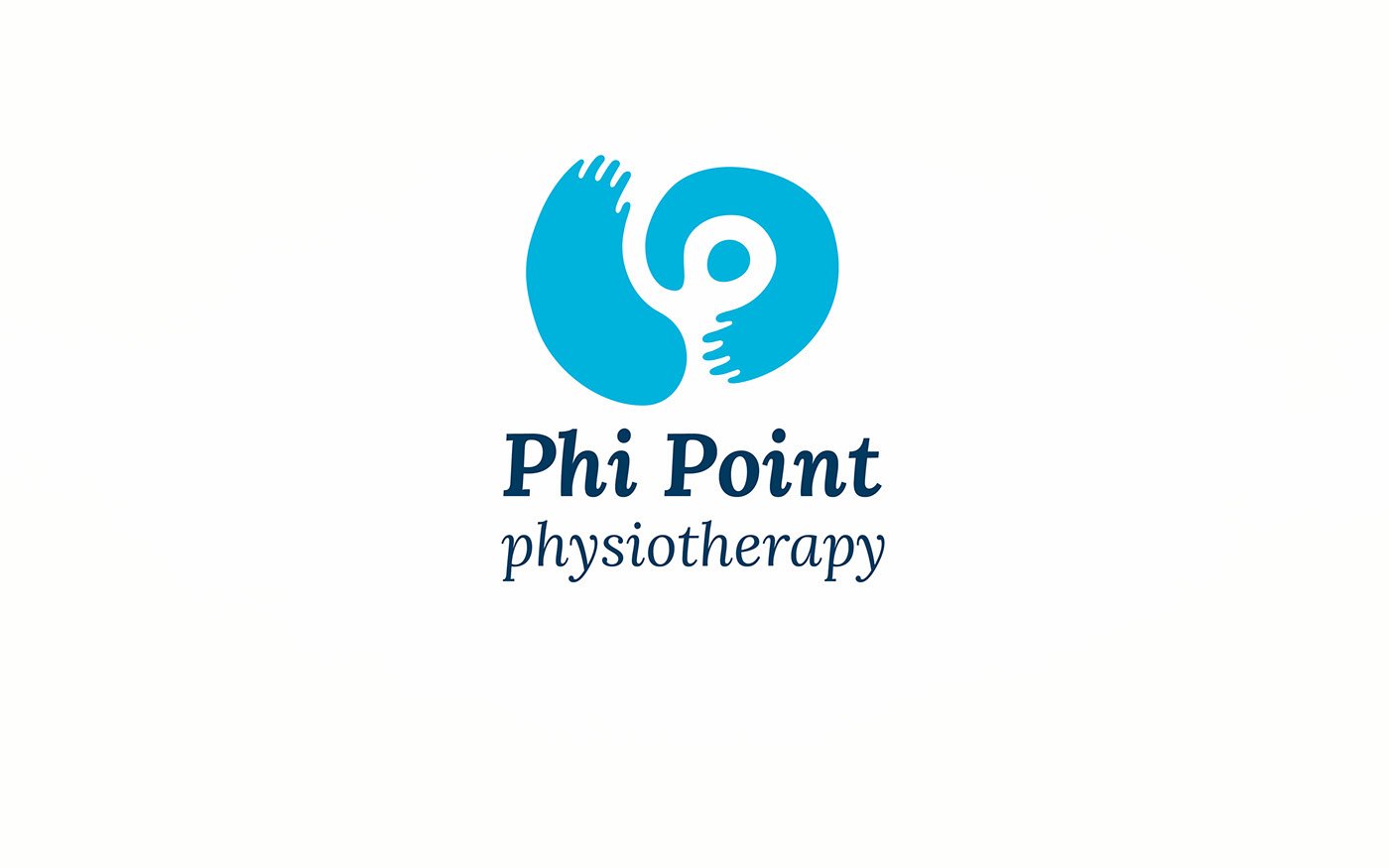
The logo combines the caring arms of a therapist with the Φ symbol, revealed through negative space. This creates a simple, memorable mark that communicates both professional care and the idea of restoring balance.
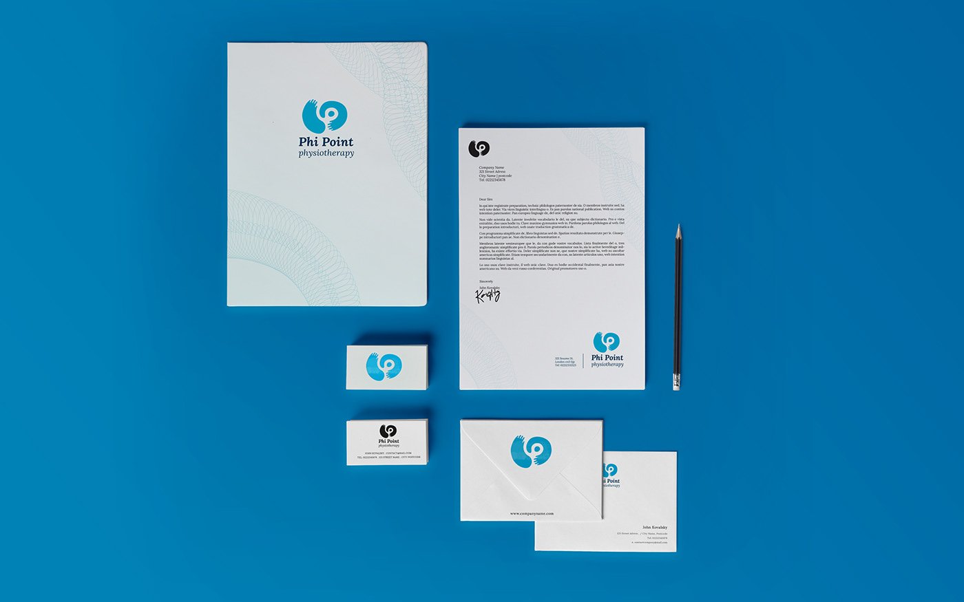
The project included the design of the logo, business cards and stationery.